All Posts, Content & Copywriting, Marketing
 The keys to persuasive, effective marketing materials are great design and informative, persuasive content. Content is both words and supporting imagery that conveys what benefits a consumer will derive from the product/service you are offering. Think of brochures as either the initial “handshake” of your business with a client or the last impression. Your business cards and brochures are essential parts of your brand and can certainly impact the marketability of your business and attracting potential clientele. This week I’d like to highlight the key components to a stand out & effective brochure.
Content can include charts, images, diagrams, listings and other graphic elements that highlight key benefits of your business services/products. Also use of calls to action can be critical to persuasion and getting the consumer to act on your solicitation. Also know that the caliber of writing of your brochure will certainly determine the effectiveness of your message and brand. If you aren’t the greatest writer, farm it out to a business or colleague that can.
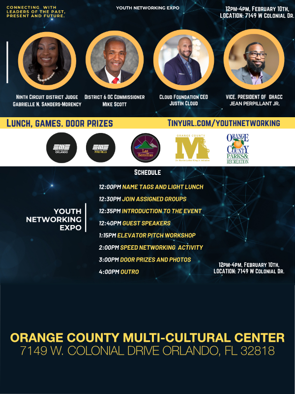
 White space is an essential part of every single marketing piece, namely brochures. The lines between text and imagery are white space; which allows your readers’ eyes relax and gives them a momentary break from the content. You never want intake overload but also don’t want your content to look too sparse. White space can also be used to separate important points. For example, the brochure below is an example of too much white space & too little content.
Colors evoke feelings and emotions, and can certainly help to build a customers’ first or last impression of your business. The colors you select for your brochure design should definitely compliment or match the colors in your logo or company name. Use of vibrant colors should be done in selective areas and in moderation.
Font selection be stylistic but be easily readable and the size should be chosen based on the volume of information you are trying to convey. It should not be too large (over 14 pt.) or too small (less than 10 pt.) The font should reflect your brand style and set the tone of your organization – elegant for a bridal shop, powerful for an auto body shop. Lastly, the body copy font should differ from your headlines, but you should not exceed the use of 3 different fonts within your brochure design.
Paper selected should be reflective of the quality of your business…Yeah, I said it. Using flimsy paper or a cheap card stock may give a flimsy impression of your business. Choosing glossy or matte finish is purely subjective.
Imagery plays a critical role just like your written content. Take your time when selecting the right imagery and the placement of them. Also, do not forget to check your resolution on the images you select. The higher the resolution the better your picture will come across in print. The lower the resolution, the more blurry and unprofessional your brochure will look when printed. FYI -300 dpi or higher is best for clear, color printing.
The Design of your brochure should be simple but effective. Feel free to break away from the normal trifold and display your brand & company character. 

Among the sea of typical trifolds, how do you make your brochure stand out?
All Posts, Web Design
 There’s an increased popularity and demand for new websites to be created on the WordPress platform. Traditionally websites are created based on HTML coding with some other goodies like CSS, JavaScript, and more added to the soup to create beautiful works of web art. There’s nothing wrong with HTML sites and they’re not fading away into what “used to be.”
For users of WordPress, it’s the ease of use and functionality of the CMS (content management system). For bloggers, its been a great tool for creating an online presence and steady content for their websites. Well now we’re seeing more and more sites used in more ways than just blogging. For the main reason of WP’s CMS structure.
There are two versions really; the free version from WordPress.com or self hosted via the source code of WordPress.org. WordPress.com gives you a free website with limited theme and plugin options as a sub-domain of the parent site. So if you went this route you would have a website that could be mywebsite.wordpress.org. For most web hosts sub-domains are free so there’s no cost to pass on to you for this. However the main drawback I see is that whatever traffic you generate will only benefit the parent site being WordPress.com Now WordPress.org gives you the structure to build WP on your on hosting server that acts just like the .com site but better and with more options. You have more control over your server files, themes, plugins, source codes and more. You can also import your .com site over to your self hosted site. Drawback is that you have to either setup WP on your own, hope that your hosting company has an easy installation feature, or pay to get hosting, domain registration, and then WP installed.
So with that all explained, let me hone in on the WordPress.org options on why it could be more convenient than standard HTML. Content management is a huge plus here because it brings the complexity level down to a progressive internet user level. Another words, if you’re familiar with any word processing application, you can manage your website on your own with WordPress.
Benefits:
- Its almost totally free
- Setting up pages are a breeze.
- Adding pictures and videos in areas and places is rather simple too.
- Page names, descriptions, tags, and keywords are also done pretty well too for SEO purposes.
- The cost of editing your website content is down to your own sweat equity
- Incorporating or creating a blog can be setup and done in 5 minutes
- Hundreds of themes are available for free and more for a small price
- Themes are easy to install (when created right and include all necessary files)
- Multiple user access with control permissions
Disadvantages:
- Page layouts are redundant through a site
- Each theme has its own limitations that may not be shared in other themes
- Many free themes that are out have no support
- Bad themes can break your whole site
- Security is a continued issue with self hosted websites
- Most themes aren’t pre-populated when you purchase them, so you have to take time to truly learn the theme to edit it to your liking
- At some point you’ll need to learn PHP if you really want to edit your themes
- Many themes have a tendency to look very similar to others
- Comment spam can get out of control if you don’t act fast to control it
What kind of platform are you currently using for your website or blog? Do you like it? Anything you wish you could do that you feel you can’t? Let me know in the comments below as well as any pros and cons you think should be added to the list above.
 The keys to persuasive, effective marketing materials are great design and informative, persuasive content. Content is both words and supporting imagery that conveys what benefits a consumer will derive from the product/service you are offering. Think of brochures as either the initial “handshake” of your business with a client or the last impression. Your business cards and brochures are essential parts of your brand and can certainly impact the marketability of your business and attracting potential clientele. This week I’d like to highlight the key components to a stand out & effective brochure.