Photography
[av_textblock size=” font_color=” color=”]
This week I shot my first house in terms of real estate photography. This is something slightly new for me because a few months ago I shot a 2b/1.5b condo. This is a new area that I’d like to add to my portfolio as well as list of photography services that I can provide. I was working with a local realtor that I have met a few times around my neighborhood. And in talking to her is how this opportunity came up.
For me lighting is everything when I’m shooting, and I brought along my wife who’s my technical director. She sees the objects, misplaced items, coordination of objects, and so much more so I’d say we’re a good team.
One thing that I wanted to mention is that this house was staged rather nicely. There wasn’t any clutter of objects or things around the floors or counters. It was like a house just done by HGTV.
The Tech Breakdown:
- Nikon D3200
- Sigma 17-70 2.8 Lens
- 3 Speedlights
- 1 150w Strobe
- An 11mm super wide lens is the next purchase I’ll be making!
You’ll be able to see for yourself my results after editing. Your comments are of course welcomed!
[/av_textblock]
[av_masonry_gallery ids=’7410,7411,7412,7413′ items=’-1′ columns=’4′ paginate=’pagination’ size=’fixed masonry’ gap=’1px’ overlay_fx=’active’ caption_elements=’none’ caption_display=’always’ container_links=’active’ id=”]
Photography
I recently did some more practice shots with my Nikon in my neighborhood. This time out I was with a good friend of mine Justin, shooting and below are the results. For me, I think I prefer to shoot portraits, though I enjoy practicing with landscape and other subjects to be a well-rounded photographer. One thing I have learned is your to choose a lens that best fits the type of photography you particularly like to shoot often.


About Design Theory, All Posts, Content & Copywriting, Web Development

Last week Design Theory allowed the outside world an inside look at our audience numbers for our weekly blog postings via Peeking Underneath the Hood at Your Blog #’s. It was great to get feedback by email and comments on the blog as to what people thought of our exposure and how that helped them to consider the importance of analytics. Most companies should know that tracking their visitors through a source like Google Analytics includes hits from search engines, pay-per-click networks, email marketing, displayed advertising and the like. Off-site analytics, like the ones I’ve demonstrated here, are to measure not just the website’s current audience but also it’s potential audience and what we at Design Theory can do to create more opportunities, exposure and buzz (aka comments) about our services. So, the analysis of our web data helps to improve the website and our blog content for Design Theory and it’s visitors.
During the last week of September
887 Page Views vs. preceding week’s 994 Page Views

As opposed to last week, this week we see a significant increase in readership directly from www.jpdesigntheory.com. Additionally, the top referring website is still Google but there seems to be a little less traffic via Google UK than the week preceding and Google.com jumped 46 more than last week as well. Last week there were very few unique readers on Monday & Tuesday (how readers are tagged via a persistent cookie that stores and returns a unique id value so that Client V is always the same Client V whenever he/she comes back to the website) but this week, there are definitely more than its predecessor (361 vs. 221). That’s great because that tells us we are reaching new people and therefore more potential clientele. As far as the blogs go, Daphne & I are still neck & neck, which once again confirms that our blogs and tags are working well for us. Lastly, as ironic as it is, our top view location moved from Ulaanbaatar, New Mexico last week to Meriden, CT this week. I can’t explain that one at all! But at least it reflects the diversity of our readers and confirms that Design Theory has a worldwide presence.
During the first week of October
717 Page Views

What I also notice right off the bat is that Tuesdays readership fell drastically and I know exactly why. I was on vacation and didn’t blog. Yes that’s right, I did it…I took a vacation and I’m not sorry about it. And although I’m not happy the numbers dipped, it did provide us with some solid intel. It shows that I have a reading audience and there is value in the content I create weekly for the blog. So Daphne metaphorically DUNKED on me HARD but that’s ok. Despite having different titles and talents, we have the same goal. And that ultimate goal is increasing the ROI that those talents provide via the blogs and the work we do for our clients.
As detailed in the Audience Stats, our number of visits/readers let us know that people are accessing our website and whether or not we are capturing new audiences. However, something this particular report doesn’t reflect (but should definitely be considered) is the bounce rate. The bounce rate tells us how many people come to our site and quickly left it. Now there are plenty of reasons that happens. Maybe someone had to answer their door or walk their dog…but most often it reflects that they didn’t find what they needed or became bored with the content. There’s no room for ego when looking at these numbers I must tell you. Because what it does is identify areas that we could improve on like imagery, written content and the ease of navigation throughout the website.
So once again we learn, we grow and do better. I’m encouraged by our numbers while knowing there’s ALWAYS room for improvement and I look forward to continue to write and put out great content & tidbits to our readers and clients.
~ Content Writing Inspiration ~ 
The beginning is easy; what happens next is much harder. ~ Anonymous
All Posts, PRESS RELEASE
Design Theory is an Orlando based design firm that provides services in web design, graphic design, content writing, and social media.
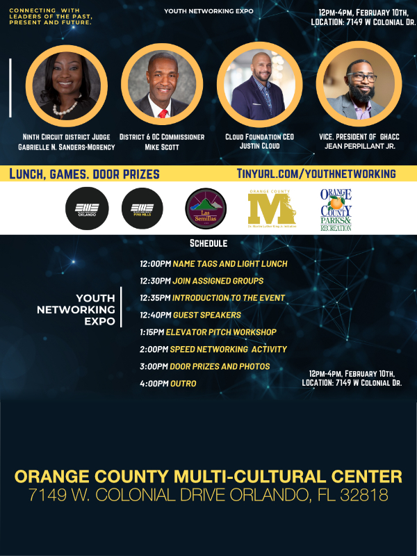
Lead by Jean Perpillant, and a team of six other creative, we are proud to play a big role in the 2012 Orlando WordCamp. We have found that WordPress to be a fantastic content management system, and offering it to our clients to manage their own sites once we’ve built them have landed us many great reviews.
By using the open sourced WordPress platform, Design Theory is able to create brilliant websites that are not only aesthetically pleasant but also functionally sound. We’ve created websites for dentists, radio talk show hosts, clothing retailers, non-profits, and many more. Integrating social media and Google analytics allows us to take our client websites to new heights in SEO and social engagement, and we look forward to sharing these insights and more at the 2012 Orlando WordCamp Conference.
With WordCamp being such a well-known conference in the web community, and Orlando quickly growing as a technology force on the East Coast, we feel it really sets the stage for a great time for learning and networking with others in our community. The scale of this event is quite large, and we anticipate the take-a-ways that all the attendees will have from it will be exponential.
For more information, please visit the official website of the 2012 Orlando WordCamp website. Be sure to reserve your tickets today, as space is sure to fill up quickly.
All Posts, Content & Copywriting
 While talking to a client about her new website that Design Theory is currently creating, we began discussing and distinguishing the differences of websites similar to her industry. During the discussion I asked her if she wanted a Pop Tart vs. Toaster Strudel design and content. We both chuckled while I explained the difference and how that would affect her readership and visitation numbers. As I explained my breakfast treat comparison, it occurred to me that this would make great content itself for a blog. So with sweet treat comparatives, tongs in hand, let’s see what the difference is and what to look out for when designing your own personal use or business website.
Sticky Jelly or Oozing Content
Pop Tarts Toaster Strudel
Can be stored at room temperature Must stay frozen until ready for consumption
No need for refrigeration Leaving it out over 12 hours may make it unfit for consumption
What does this say about the quality of your content & about your website? Quickly written, often plagiarized content will only be worth the effort put into it. However content that is fresh, witty and deliberate will evoke the proper response for the goal set before it. It will be more pleasing and can easily be distinguished. And that’s exactly what you want and need to get your product and/or services sold. Once again, it’s a distinction between what looks good and achieves the goal that should direct the content accordingly.
Static or Creative Icing
Is your content very cookie-cutter, stationary or could be considered stale? Or does the verbiage move, flow and swirl to create interest and hold your reader’s attention? Is your use of imagery typical or often used stock photography or is it distinctive and has an artistic, creative flare to it? When choosing imagery, keep in mind that it should enhance and not compete with your written content to give a cohesive and an overall polished look to your website. You can have fun and go outside the box with most industries. Even content that is more factual and less opinionated can be creatively distinct while getting your message across and conveying important information.
Sometimes Pricing Makes a Difference, Sometimes Not
Pop Tarts Toaster Strudel
$3.99 for a 8 piece box $3 for a 6 pastry box
Being in the middle of the pricing spectrum for websites, we at Design Theory have had to burst the bubble of misconceptions when it comes to our prices versus the quality of talent/work we do. Our goal is to match the goals and level of business of a client’s company with a website that will do just that within the confines of their allotted budget. Now sometimes we have to push back and encourage a particular client to go beyond their budget and give them some industry inside look as to why. And because we do what we do well, it’s usually not hard for them to acknowledge the benefits of doing so and agree. But for other companies, just be aware that all that glitters may not be gold and likewise, the cheapest design/pricing may not be tarnished brass. Remember, there’s a difference between cheap and affordable web designs. I believe you have to ask the right questions, look at a company’s track record/dossier and determine what’s best for your business. Then you can make an educated decision about how much you NEED to pay for a website that fulfills its purpose for your business or personal objectives.
So depending on what your business palate wants and needs, you can determine whether you choose a “mediocre but gets the job done” website & content, or if you’re in need of a step-up, more sophisticated level design. Whichever works for you, make sure you choose well and always consider the palate of your consumers.
~ Content Writing Inspiration ~ 
True Ease in Writing comes from Art, not Chance,
As those move easiest who have learn’d to dance.
~Alexander Pope, “An Essay on Criticism”
