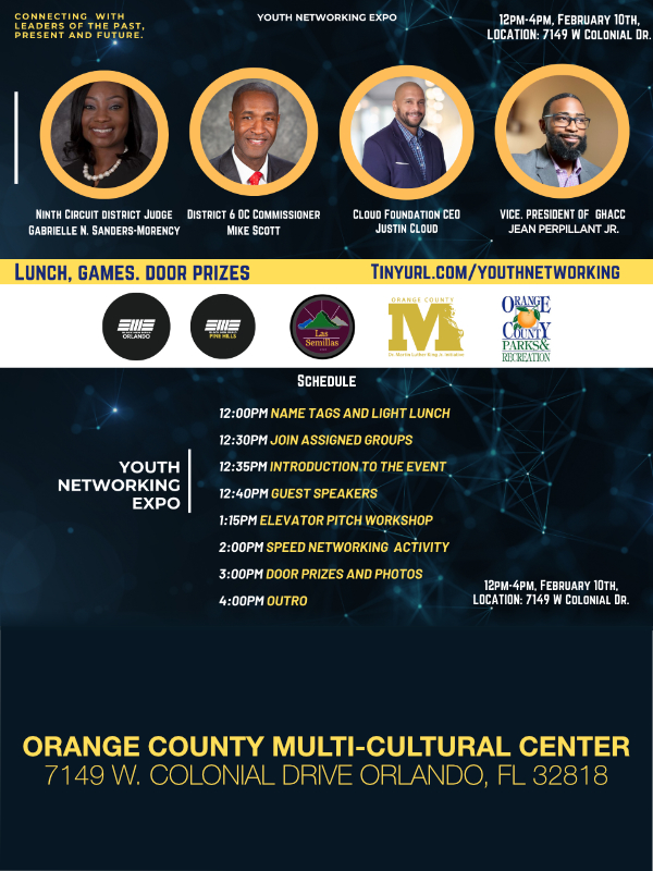
2012 Olympics, All Posts, Branding, Content & Copywriting, Marketing, Web Design
 Google and Yahoo have always been on different paths in the quest for being king of the hill among search engines. But as I went to each site looking for Olympic updates & information, I noticed a glaringly obvious difference between the Gold & the Bronze when it came to their homepage content strategy for the 2012 London Games. As the two giants regularly tussle for domination of their sectors, is the competition fierce for the web visitors and advertising dollars during the games? As it’s been pointed out on several occasions, Yahoo has (or “is” based on opinion) a big branded advertising business and isn’t shy about it. Google is all search – you get no advertising on its homepage whatsoever. One could say that Yahoo’s homepage creates a schizophrenic type atmosphere and Google chooses to reflect why people go to any search engine at all – to simply search. Each has a diametrical perspective; which may or may not be shared by minimalistic loving web surfers or those who want to know everything every moment of every day.
Now it may just simply be “tomato v. tomahto” – all up to the users choice of flavor. Let’s see where these two rivals stand on the content podium for the 2012 Olympic Games looking at just this one, but VERY TELLING facet – the homepage. For this year’s Olympics, you can almost see the tumbleweed across Google’s homepage with nothing more than a clip-artish image above its unapologetic, simplistic search box. Whereas Yahoo completely capitalizes on the opportunity to lavish (and possibly overwhelm) you with up-to-the-minute stats on what sport is broadcasting, which country is leading in medals, and all note & news-worthy headlines from every vantage point of this historical event. 

Could it be that the choice of a clip-artish image was a passive-aggressive “thumbing of the nose” at Yahoo’s voracious need for your attention? If so, Google gets benched on the therapy couch for this one…lol. But before they end up neck and neck for your search engine loyalty, what finds them at the same starting line is the intent of the user. If one chooses to be in the know, then Yahoo wins hands-down because it is in part what they do best. Yahoo hand-holds you every day, all day- showing you what’s hot (and not) and postings about every media event worldwide. They actually look to be a strategic partner with both their advertisers and users alike. So you are ALWAYS in the loop, whether you want to be or not when just searching for let’s say a great vinaigrette recipe.
Die-hard Google fans will say that their fearless leader displays a search engine decorum truly lacking in their competitor and that if people want news, the can get news BUT only when they ask for news. They provide a discriminating à la carte rather than a force feeding approach. At the end of the day, Yahoo hands down is a true entertainment portal capable of satisfying various entertainment and leisure users. For better or for worst, Google isn’t trying to be an entertainment portal, so it doesn’t even come close to competing with Yahoo in this regard.
So as far as the 2012 Search Engine Homepage Olympics are concerned, Yahoo’s neck is a little more laden than its competitor. Now I know that Goolge lovers might say that “everything that glitters isn’t gold”…Well I guess you’re not Yahoo then are you? LOL.
All Posts, Web Design, Web Development
 When a new website is completed and launched, there is a great sense of relief and jubilation from my design firm. All the extra work we put into a project feels like it was so worth it. Almost like we could have done it for free had we been given the chance. Hearing how the client or group is so excited and hearing their praises gives us some great confidence and feedback that we met or exceeded their expectations. However the project actually isn’t completed at that point. I pull together all the staff members who were involved with the project for an exit interview.
In Corporate America when someone is let go from a job or moving to a new department, the sitting manager or HR representative will host a meeting with the employee that is moving to get their honest opinion on their soon to be previous role. Their asked to be candid and explain how they felt about their manager, job function, duties, achievements, and of course moral. The end of a design I feel should be the same in some aspects.
Some things to consider or talk about with your team or reflect on yourself would be:
Content: Was there enough content provided from the beginning? How much copy needed to be edited or rewritten? Did the client provide enough? Was I delivered or provided to us on time or when asked?
Budget: Was the client charged adequately for every deliverable we were tasked with. Did we find any areas in the project that could have been handled a different way that would have given us more services we could have offered? Does it seem like the client would have paid more for the same level of service?
Timeline: Did we beat our deadline? We’re we late and why? What were some factors that contributed to our timeline. How can we avoid any setbacks on our end or the clients going forward. We’re they’re new requests submitted that effected the timeline that was not accounted for?
Teamwork: Overall how did everyone work together? Did anyone feel like they didn’t get their opinions expressed or considered enough? Did everyone pull their weight? Did everyone feel they were given all they needed to complete their tasks? Was the communication across the team well enough or does it need improvement? What was the best medium for communication?
Customer Experience: Did the customer play a big enough role in the project. Were there enough options provided yet not too much to hinder a confident choice? Did all the team members have a chance to meet and/or talk to the client? We’re all of our responses timely? Did email communications go well, or could more phone calls iron out misunderstandings?
After reading through these I’m sure you may have wondered or even asked some of these questions to yourself after completing a project. It may seem a bit time-consuming but I promise you it’s worth the effort. It will help you avoid mistakes in your future projects while providing some self-examination to your firm and tactics. If you have some other points to add please do so in the comments below. As always we love hearing your opinions and contrary thoughts.
(Image credit: auremar / 123RF Stock Photo)
All Posts, Marketing
 My kids recently taught me a lesson in how they view the world I’ve put around them. Eating dinner and taking showers aren’t they’re most favorite things to do. But having “lunch” and taking bubble baths are. At first glance the two comparisons don’t seem to be much, but they actually are. It’s all in the wrapping and presentation. Much like how toys are always in bright vibrant colors, and most other products are boring and bland colored.
Consider your current design services. You probably have a website, tri-fold brochure, business card, and maybe a postcard flyer. What I want you to think about or review is how each of those mediums may look to your potential clients. Lets strip away all the marketing views for now, and focus purely on design and eye-candy appeal. Most consumers are impulse buyers. I’d like to separate that into two: visual impulse and conceptual impulse.
Visually your mediums should be entertaining to the eyes when they first see it. Almost telling a story about how much fun they’ll have with this new possible toy. Remember how excited you would get seeing that new commercial for a G.I. Joe action figure? You knew it didn’t move on its own, but seeing it do all those cool moves in the commercial gave you this urge that you had to have it. You visually saw yourself playing with that toy the same way.
A more aggressive approach would be to fine tune some of your mediums for the conceptual business owners. They’ll purchase mainly because they already understand a specific service or product need in their minds. Sure you may offer many design services, but they’re only interested in one. Once you can identify that, it will become your open door to offering other companion services to them.
I would suggest the same for when you setup a package specific for a new potential client. Do a little research and see if you can find out what may be eye-catching to them. If it’s through someone who may be referring you to their associate, ask questions about habits, likes, and what they favor. Use this information to almost customize your approach and re-edit your flyers and media kit to really get that “new toy” mesmerizing effect. Here are some tips:
- Less clutter – It’s easier to grab a potential client’s attention when they don’t have to use too much of their brain or eyes overlooking a lot of content. That goes from websites to business cards.
- Choose to use colors or Not – Bright colors aren’t necessarily always a good thing. Sometimes all white with one accent color could stand out more than a rainbow. However some well placed bright colors have a way of bringing back memories of long-lost toys that we loved when we were younger.
- Vectors or real Pictures – This is another either or cases here. And I’m not talking clip art. If you’re more into vectors then stay there and keep with the theme. Same if you’re using real images. But with real images you can do a lot of easy editing to have so cool effects that could create a visual for a client’s own product.
- Current Trends and Themes – When Transformers came out, big companies were falling over themselves to jump on the bandwagon and cross-promote using the Autobots and their products. If you have time, why not do the same with some of your flyers or brochures or website. It’s sure to get attention and spark conversation. The key would be to tie that in to a specific service on your part though.
Have you used this strategy before? If so I’d like to hear about it. Any other points and comments are also welcome in the fields below.